
Case Study: blueegg
Case Study: blueegg
Establishing structure, scalability, and a consistent design language
Establishing structure, scalability, and a consistent design language

Overview
Overview
Overview
blueegg is a Sydney-based UX agency working with clients across government, education and FMCG sectors including organisations like NBN co., Woolworths and SES. Despite their reputation for thoughtful, user-centered work, their own website hadn’t kept pace with the agency’s growth.
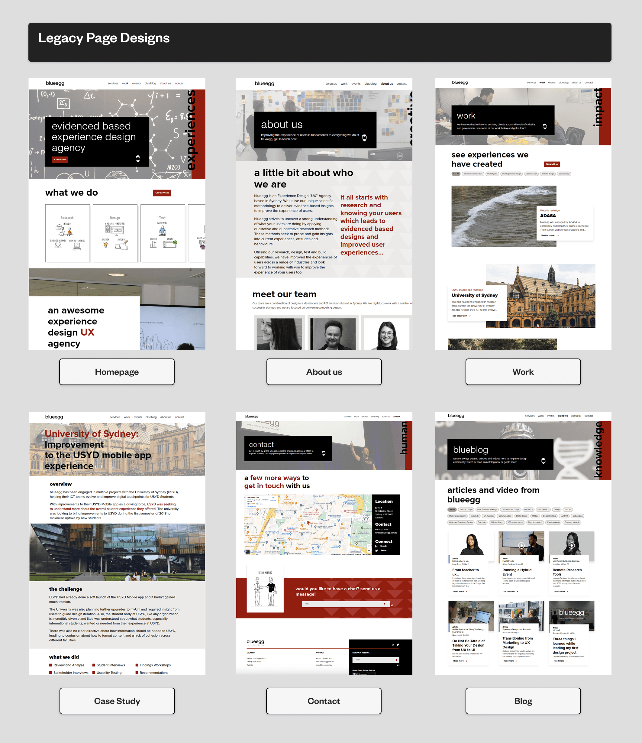
The legacy site was visually outdated, difficult to navigate on mobile, and limited in how it showcased the agency’s work or conveyed it’s value. It also lacked the structural flexibility to adapt to new formats - whether that was case studies, team updates or pitch content.
This was blueegg’s first major redesign, and it needed to set the tone for the next chapter.
blueegg is a Sydney-based UX agency working with clients across government, education and FMCG sectors including organisations like NBN co., Woolworths and SES. Despite their reputation for thoughtful, user-centered work, their own website hadn’t kept pace with the agency’s growth.
The legacy site was visually outdated, difficult to navigate on mobile, and limited in how it showcased the agency’s work or conveyed it’s value. It also lacked the structural flexibility to adapt to new formats - whether that was case studies, team updates or pitch content.
This was blueegg’s first major redesign, and it needed to set the tone for the next chapter.

The Challenge
The Challenge
While blueegg’s work as a UX agency was trusted by major clients, their own website hadn’t kept pace. The previous site was not responsive across devices, lacked clear visual hierarchy, and made it difficult for prospective clients to assess the agency’s capabilities. There was no formal design system in place and the tone of voice felt inconsistent with the maturity of the brand.
While blueegg’s work as a UX agency was trusted by major clients, their own website hadn’t kept pace. The previous site was not responsive across devices, lacked clear visual hierarchy, and made it difficult for prospective clients to assess the agency’s capabilities. There was no formal design system in place and the tone of voice felt inconsistent with the maturity of the brand.
Internally, time was limited and the delivery window was tight - just under 8 weeks. The developer assigned to the project was based in San Francisco, which meant asynchronous handoffs and clear communication were essential. With no structured discovery phase, the project began with a high-level brief from the CEO, and progressed through iterative stakeholder input and design-led problem framing.
Internally, time was limited and the delivery window was tight - just under 8 weeks. The developer assigned to the project was based in San Francisco, which meant asynchronous handoffs and clear communication were essential. With no structured discovery phase, the project began with a high-level brief from the CEO, and progressed through iterative stakeholder input and design-led problem framing.
Goals
Goals
This wasn’t just a cosmetic uplift, the redesign needed to modernise blueegg’s digital presence while supporting future growth.
With no structured IA or design system in place the new design had to do more than look clean, it needed to scale, flex and communicate brand value clearly.
This wasn’t just a cosmetic uplift, the redesign needed to modernise blueegg’s digital presence while supporting future growth.
With no structured IA or design system in place the new design had to do more than look clean, it needed to scale, flex and communicate brand value clearly.
Establish a modular, scalable design language
The visual system needed to extend beyond the website and across social posts, internal decks and future content types without becoming restrictive.
Establish a modular, scalable design language
The visual system needed to extend beyond the website and across social posts, internal decks and future content types without becoming restrictive.
Create a responsive, accessible user experience
Mobile usability and WCAG compliance were non-negotiable. Every screen, component, and interaction had to work cleanly across devices and for all users.
Create a responsive, accessible user experience
Mobile usability and WCAG compliance were non-negotiable. Every screen, component, and interaction had to work cleanly across devices and for all users.
Increase clarity and trust for prospective clients
From a cleaner information hierarchy to refined microcopy, the site needed to help users quickly understand what blueegg did and how they worked.
Increase clarity and trust for prospective clients
From a cleaner information hierarchy to refined microcopy, the site needed to help users quickly understand what blueegg did and how they worked.
Discovery
Discovery
Approach
Approach
Alignment without discovery
Alignment without discovery
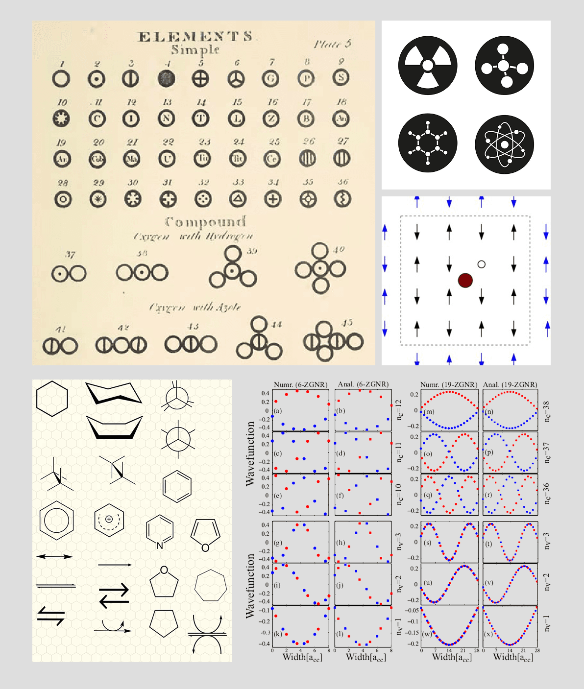
There was no formal discovery phase, just a verbal brief from the CEO, a former pharmaceutical scientist, who had a strong visual sensibility. He wanted the new site to reflect the simplicity and clarity of scientific discovery: minimal colour, clean geometry and symbolic references to chemistry.
From this, I inferred a visual language built on atomic structures - circles, neutral tones and functional layouts - which shaped both the illustration styles and UI components.
Clarifying content structure
Clarifying content structure
The new website was structured into six core pages and were prioritised based on business needs and visibility:
The new website was structured into six core pages and were prioritised based on business needs and visibility:
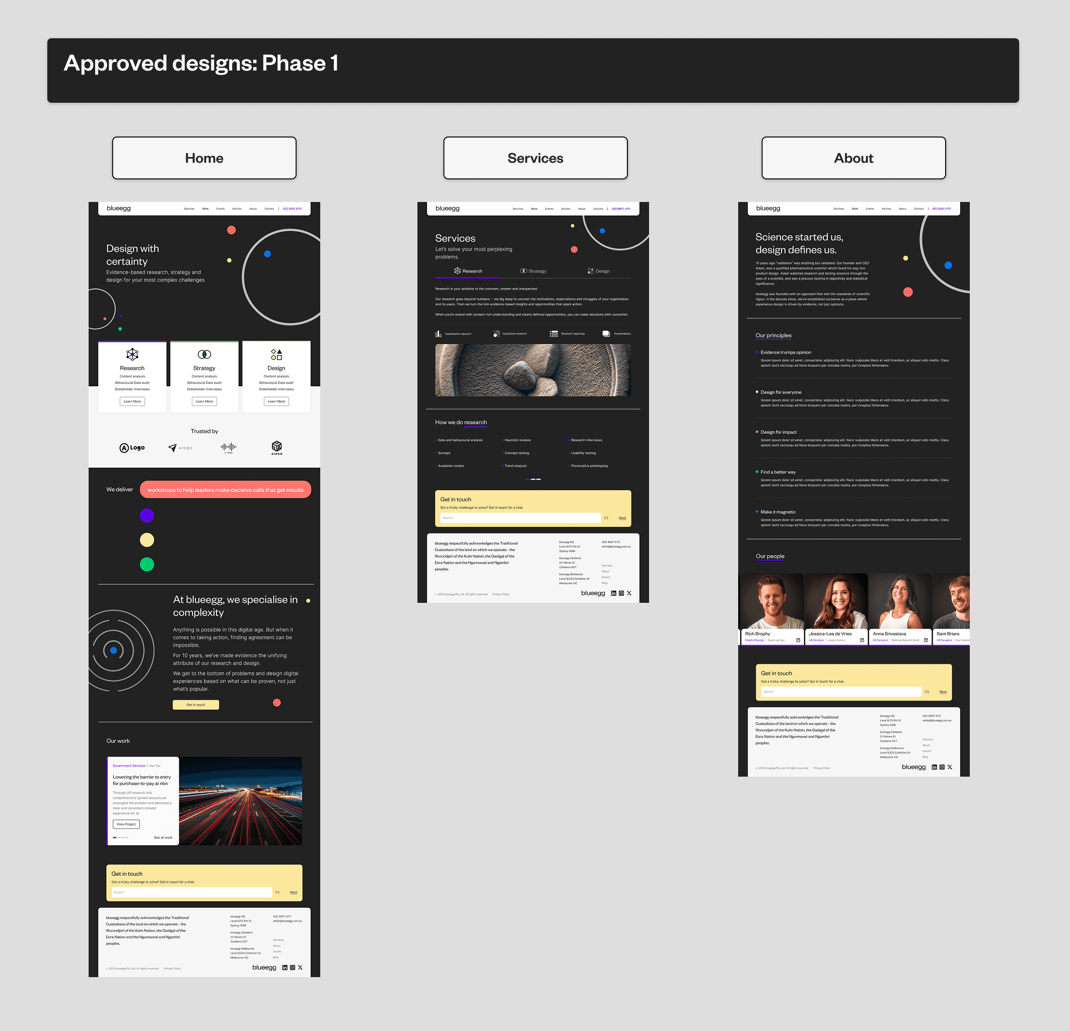
Phase 1: Delivered first to anchor the site’s messaging and credibility:
• Home
Services
About
Phase 1: Delivered first to anchor the site’s messaging and credibility:
• Home
Services
About
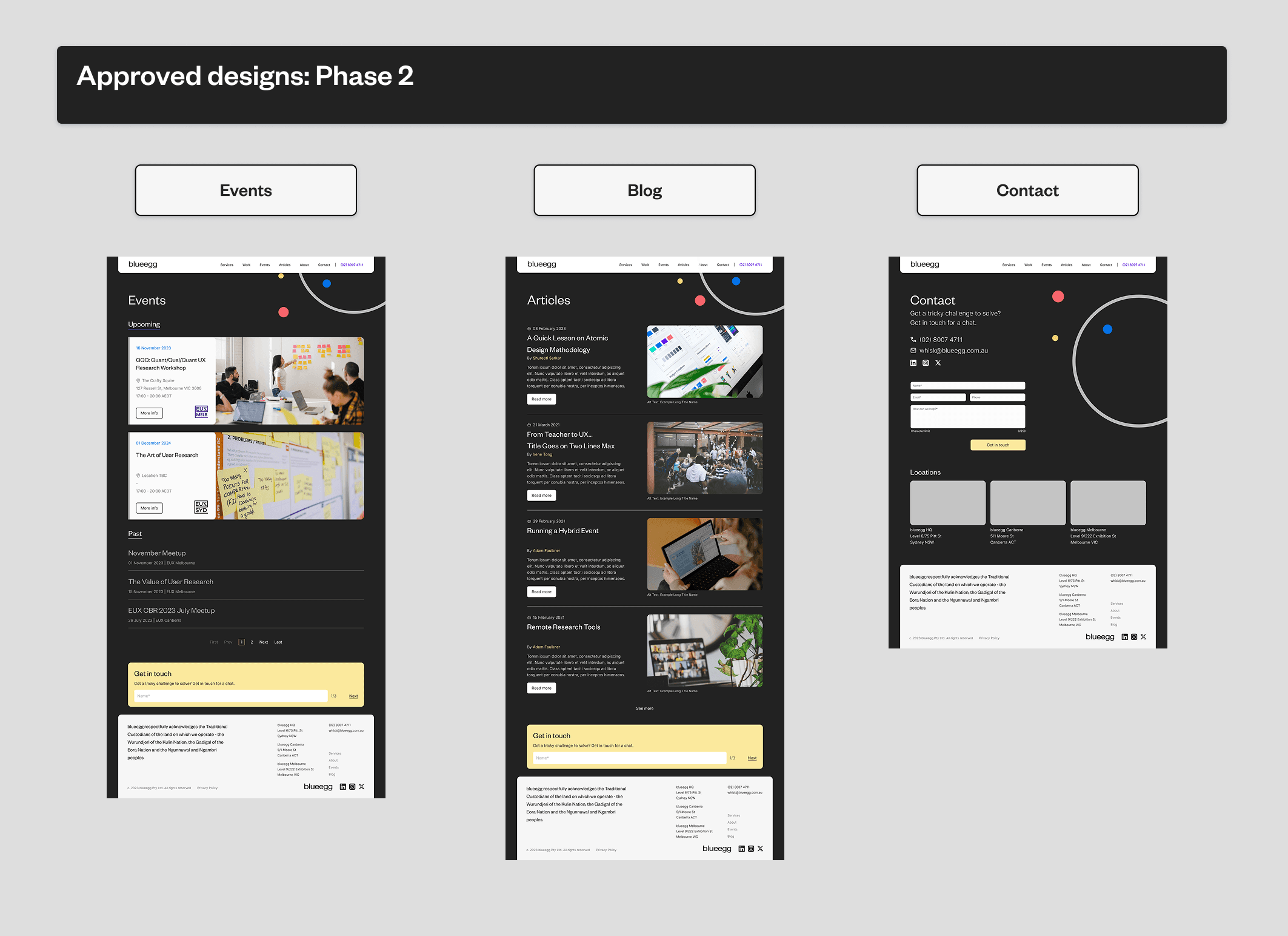
Phase 2: To be delivered once the visual and verbal identity had been established:
Events
Blog
Contact
Phase 2: To be delivered once the visual and verbal identity had been established:
Events
Blog
Contact
Each page was designed with scalability in mind and intentionally content-light, focusing on scanability, clear hierarchy, and strong calls to action. The content strategy aimed to reduce friction and help prospective clients quickly understand blueegg’s capabilities and values.
Each page was designed with scalability in mind and intentionally content-light, focusing on scanability, clear hierarchy, and strong calls to action. The content strategy aimed to reduce friction and help prospective clients quickly understand blueegg’s capabilities and values.
Async handoff and developer collaboration
Async handoff and developer collaboration
The developer was based in San Francisco, which meant that timezone differences could either become a blocker, or a strategic advantage. We chose the latter.
We managed delivery across the following platforms:
The developer was based in San Francisco, which meant that timezone differences could either become a blocker, or a strategic advantage.
We chose the latter.
We managed delivery across the following platforms:
The developer was based in San Francisco, which meant that timezone differences could either become a blocker, or a strategic advantage.
We chose the latter.
We managed delivery across the following platforms:
Asana, for shared timelines and milestones tracking
Asana, for shared timelines and milestones tracking
Airtable, for logging queries, bugs and change requests
Airtable, for logging queries, bugs and change requests

Slack, for direct comms between me, the CEO, Design Lead and the Developer
Slack, for direct comms between me, the CEO, Design Lead and the Developer
Figma, for design iteration and design documentation
Figma, for design iteration and design documentation
Every day, I’d hand off annotated designs and changelogs before logging off, waking up to implemented changes and feedback ready for review. This rhythm allowed us to iterate faster, with fewer misunderstandings and near-zero rework. The async workflow became so effective that I was later asked to deliver an internal presentation “Working with Developers” to help other designers improve their developer collaboration.
Every day, I’d hand off annotated designs and changelogs before logging off, waking up to implemented changes and feedback ready for review. This rhythm allowed us to iterate faster, with fewer misunderstandings and near-zero rework. The async workflow became so effective that I was later asked to deliver an internal presentation “Working with Developers” to help other designers improve their developer collaboration.
Design
Design
Design Exploration
Design Exploration
While earlier internal explorations had tested various minimalist treatments, they often lacked a cohesive system or consistent use of components. My goal was to bring structure to that visual language while anchoring it to a clear creative idea: scientific clarity.
While earlier internal explorations had tested various minimalist treatments, they often lacked a cohesive system or consistent use of components. My goal was to bring structure to that visual language while anchoring it to a clear creative idea: scientific clarity.
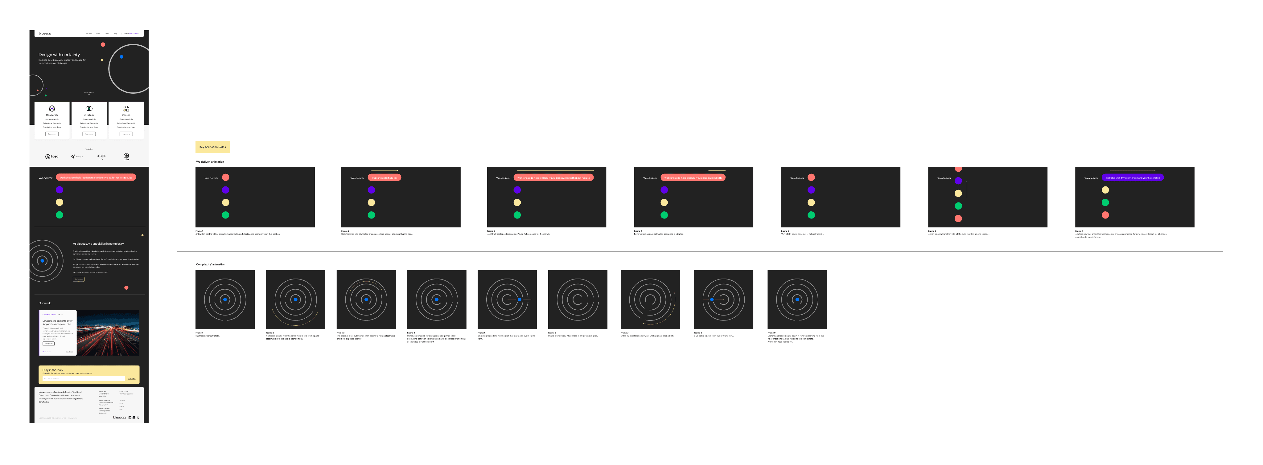
Inspired by the CEO’s background in pharmaceutical science, I drew on visual references from chemistry and medical iconography - sonograms, atomic structures, and clean geometric diagrams. This translated into a visual motif of simple circular elements, used sparingly throughout the site to create moments of identity without overpowering the content.
Inspired by the CEO’s background in pharmaceutical science, I drew on visual references from chemistry and medical iconography - sonograms, atomic structures, and clean geometric diagrams. This translated into a visual motif of simple circular elements, used sparingly throughout the site to create moments of identity without overpowering the content.
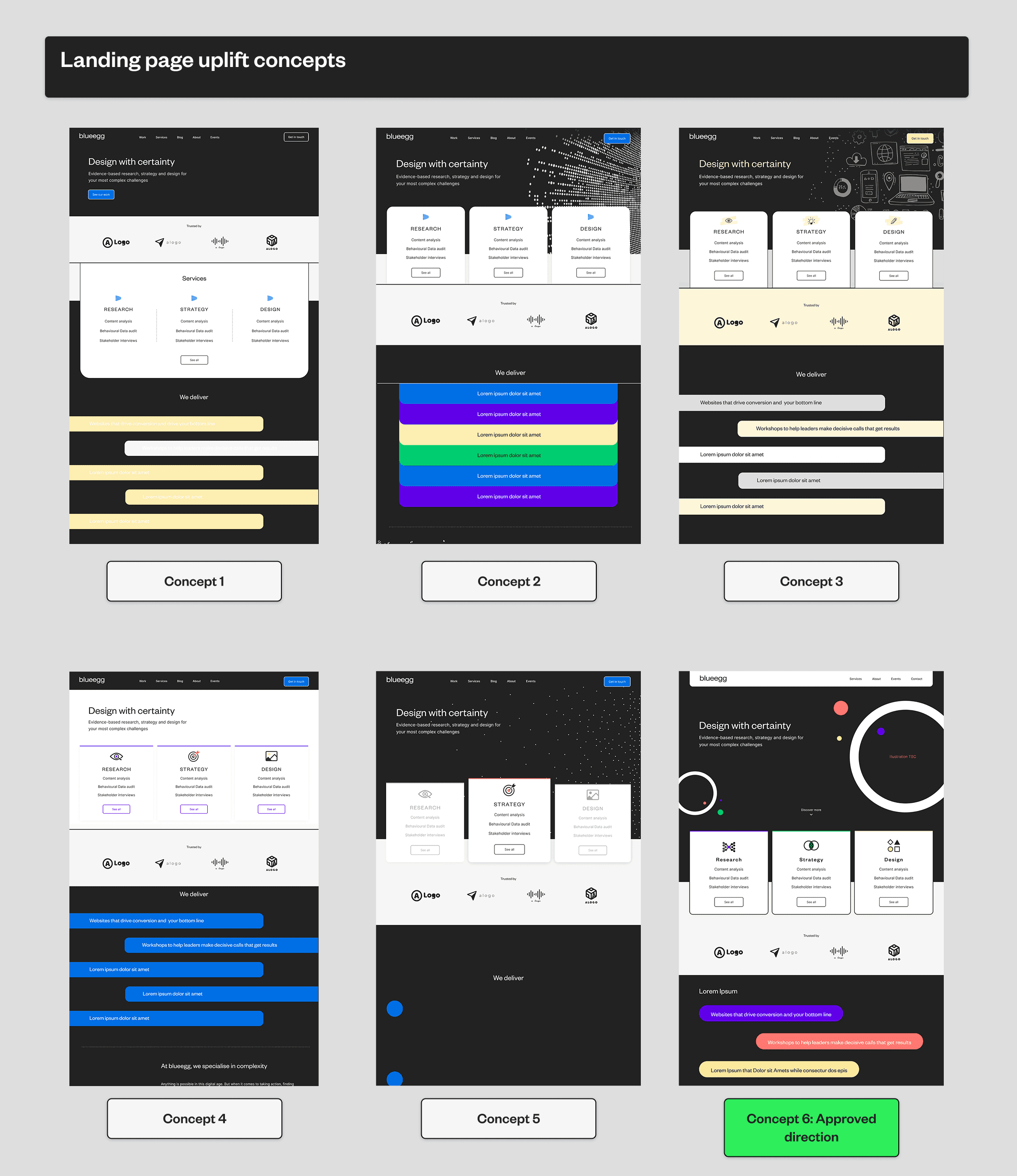
In order to gain alignment, I presented several homepage directions early on, all rooted in the same logic, but varying slightly in tone and layout. Once the CEO signed off on the preferred direction, I moved into the production of the remaining Phase 1 pages.
In order to gain alignment, I presented several homepage directions early on, all rooted in the same logic, but varying slightly in tone and layout. Once the CEO signed off on the preferred direction, I moved into the production of the remaining Phase 1 pages.
Throughout this initial design exploration process, the developer remained in the loop to validate feasibility and ensure all creative decisions could be executed in Hubspot.
Throughout this initial design exploration process, the developer remained in the loop to validate feasibility and ensure all creative decisions could be executed in Hubspot.
Phase 1
Phase 1
Phase 2
Phase 2
Delivery
Delivery
Hubspot Implementation
Hubspot Implementation
With designs approved, I shifted into implementation mode, working closely with our San Francisco-based developer to bring the site to life. The 17-hour time difference shaped our rhythm: I’d wrap up annotated designs and change-logs each evening, and by morning I’d be reviewing fresh builds and logging QA feedback.
With designs approved, I shifted into implementation mode, working closely with our San Francisco-based developer to bring the site to life. The 17-hour time difference shaped our rhythm: I’d wrap up annotated designs and change-logs each evening, and by morning I’d be reviewing fresh builds and logging QA feedback.
To ensure smooth execution, I created detailed component documentation and maintained a changelog that helped the developer track decisions asynchronously. I also tested responsive breakpoints manually and flagged WCAG compliance issues as we went along.
To ensure smooth execution, I created detailed component documentation and maintained a changelog that helped the developer track decisions asynchronously. I also tested responsive breakpoints manually and flagged WCAG compliance issues as we went along.
Importantly, implementation wasn’t treated as handoff - it was a continuation of the design process. I stayed embedded across the full dev cycle to ensure fidelity, clarify intent, and prioritise final polish. The collaborative approach minimised feedback loops and ensured a clean and timely launch, even with no dedicated QA team.
Importantly, implementation wasn’t treated as handoff - it was a continuation of the design process. I stayed embedded across the full dev cycle to ensure fidelity, clarify intent, and prioritise final polish. The collaborative approach minimised feedback loops and ensured a clean and timely launch, even with no dedicated QA team.
Outcomes
Outcomes
The final product
The final product
The new blueegg website launched as a fully responsive, WCAG-compliant experience, significantly improving clarity, accessibility and brand cohesion across channels. By reworking the content structure and applying a modular design system, the new site better reflected the agency’s maturity and credibility.
The new blueegg website launched as a fully responsive, WCAG-compliant experience, significantly improving clarity, accessibility and brand cohesion across channels. By reworking the content structure and applying a modular design system, the new site better reflected the agency’s maturity and credibility.
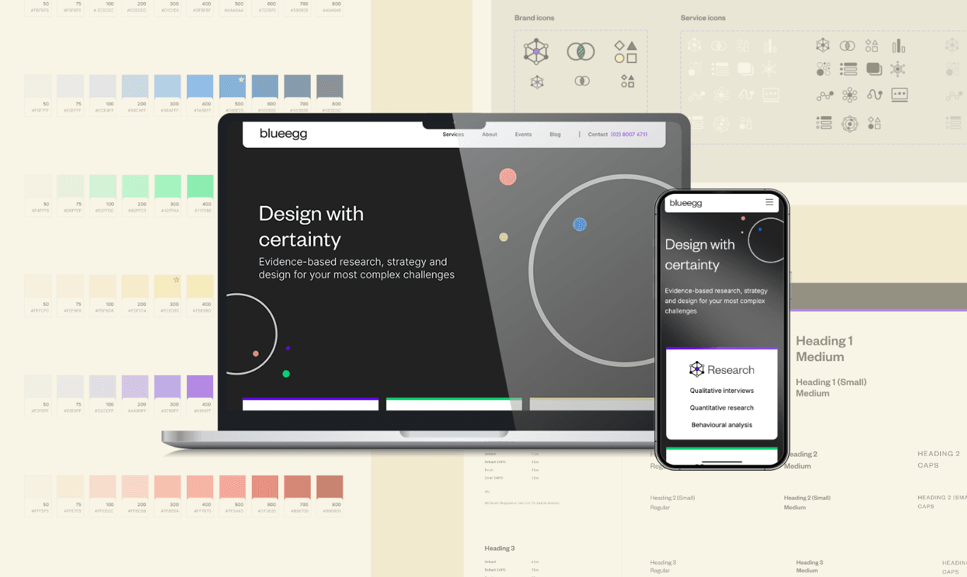
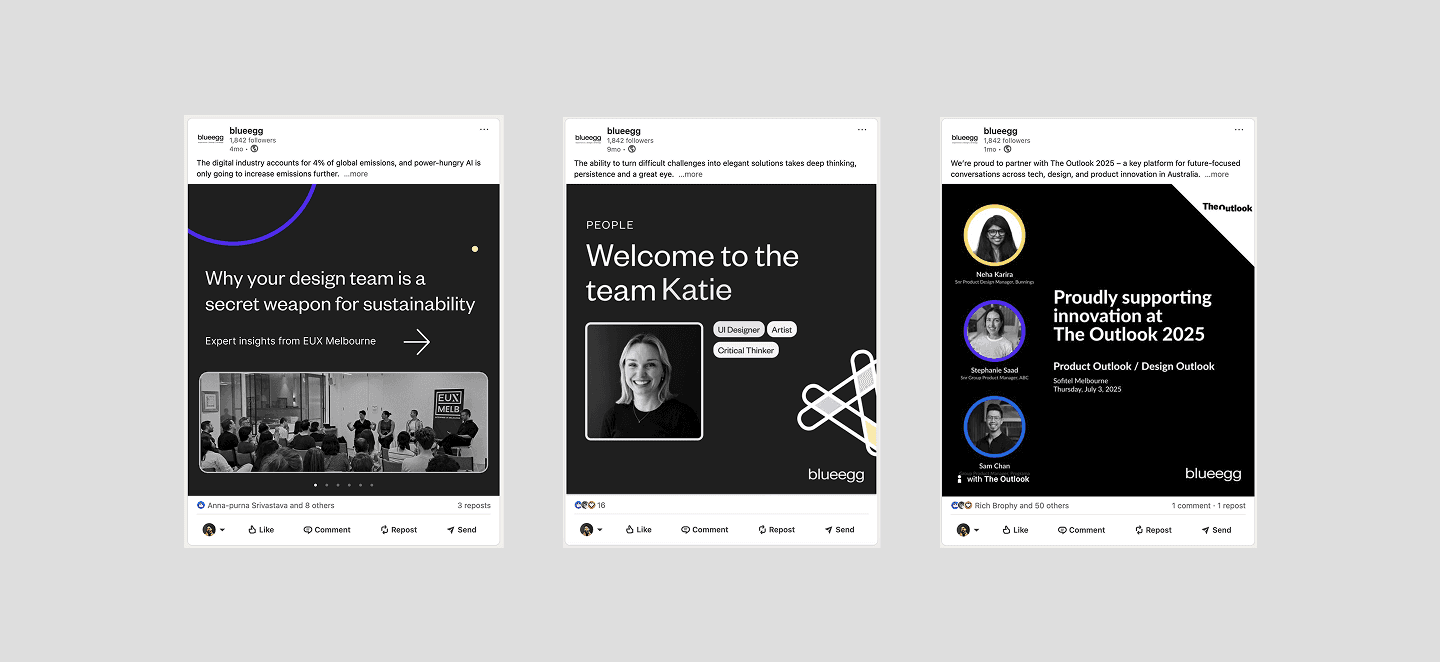
The visual identity extended naturally into social posts, pitch decks, and newsletters, creating a consistent brand experience across every external touchpoint.
The visual identity extended naturally into social posts, pitch decks, and newsletters, creating a consistent brand experience across every external touchpoint.
Key outcomes
Key outcomes
Internally the project was seen as a success, not just in design, but in execution. My collaboration with the developer was highlighted by leadership as a key strength, particularly the way we navigated time zones, reduced ambiguity and sustainable delivery velocity.
This led to an internal talk I gave entitled “Bridging the gap” - focused on improving designer-developer collaboration.
6
6
Modular, mobile-first pages delivered
Modular, mobile-first pages delivered
100%
100%
WCAG Compliant
WCAG Compliant
<8
<8
weeks from brief to launch
weeks from brief to launch
Reflections
Reflections
Key learnings
Key learnings
This project reinforced how much structure can emerge from constraint. With no formal discovery, a short timeline and a remote build partner, the challenge wasn't just to design well - it was to design deliberately and decisively.
This project reinforced how much structure can emerge from constraint. With no formal discovery, a short timeline and a remote build partner, the challenge wasn't just to design well - it was to design deliberately and decisively.
I was trusted to define the visual direction, interpret abstract requirements, and make key UX decisions with minimal oversight. That level of creative autonomy gave me space to explore, but also sharpened my ability to self-direct under pressure.
I was trusted to define the visual direction, interpret abstract requirements, and make key UX decisions with minimal oversight. That level of creative autonomy gave me space to explore, but also sharpened my ability to self-direct under pressure.
Momentum is often more valuable than perfection
Clarity, confidence and alignment kept the project moving forward under tight constraints.
Momentum is often more valuable than perfection
Clarity, confidence and alignment kept the project moving forward under tight constraints.
Cross-functional trust builds better products
Building a strong rapport and early developer involvement helped avoid ambiguity and reduce rework.
Cross-functional trust builds better products
Building a strong rapport and early developer involvement helped avoid ambiguity and reduce rework.
Strong design can emerge from abstract prompts
Especially when paired with system thinking and clear intent.
Strong design can emerge from abstract prompts
Especially when paired with system thinking and clear intent.